Creation of BAMBA (Bay Area Mountain Bike Association) Branding
I worked with a colleague from the Bay Area to help him create the branding behind his mountain biking association. I chose the font, colors, and designed the logo which is now being used on stickers, t-shirts, and hats. When discussing the concept for this brand, the words that were used were: earthy, natural, and inviting.
I've included initial word mark options, rough sketches as well as final logo iterations showing how well the colors work together and can be mixed and matched.
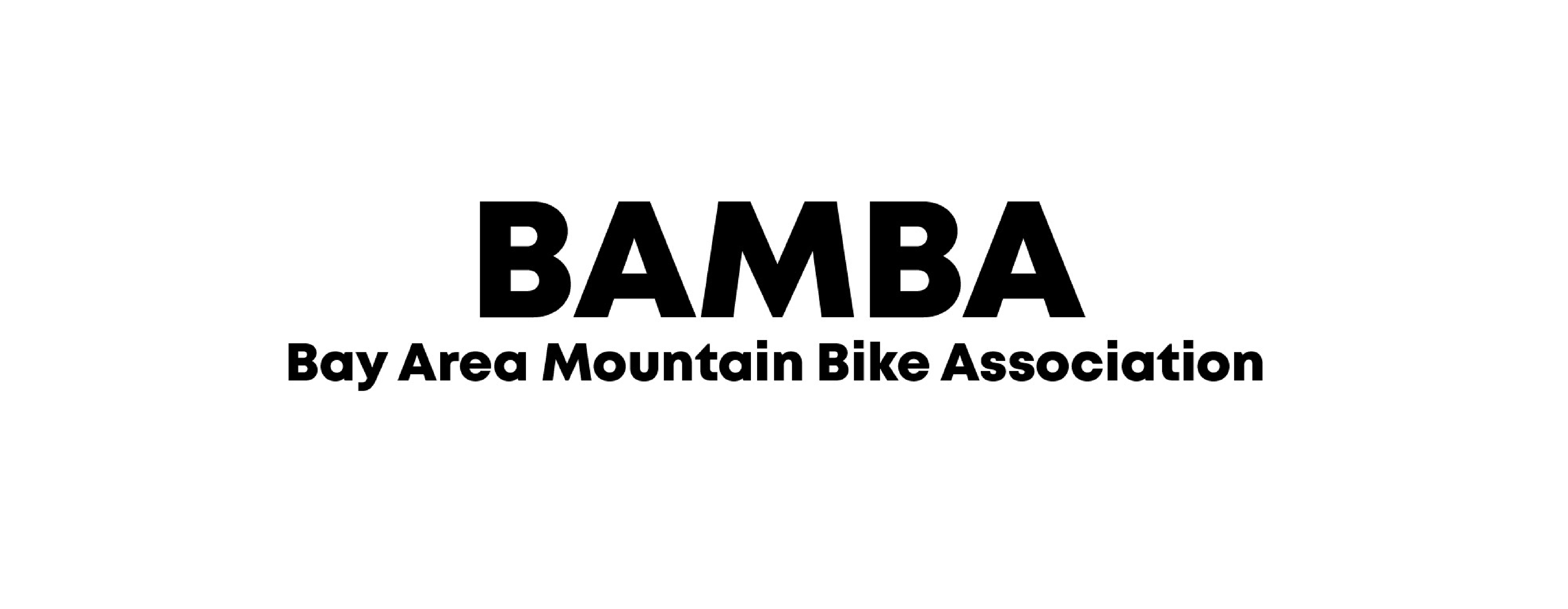
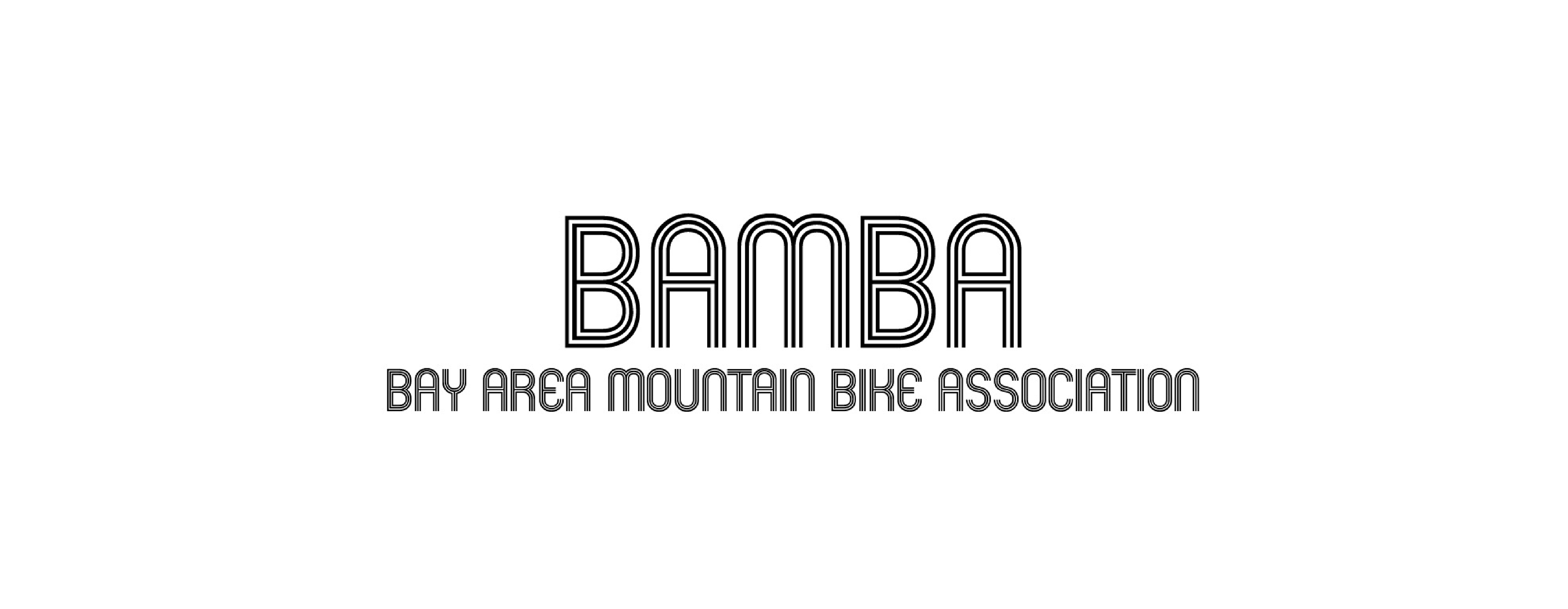
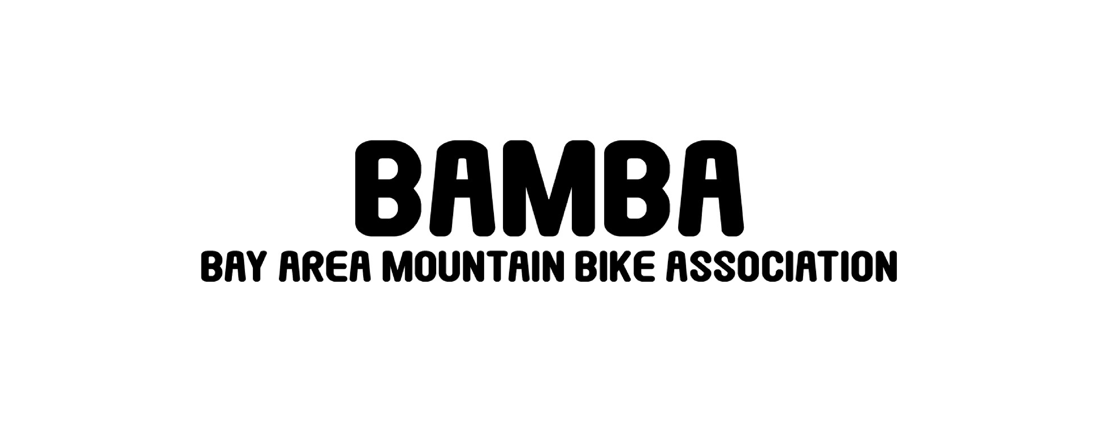
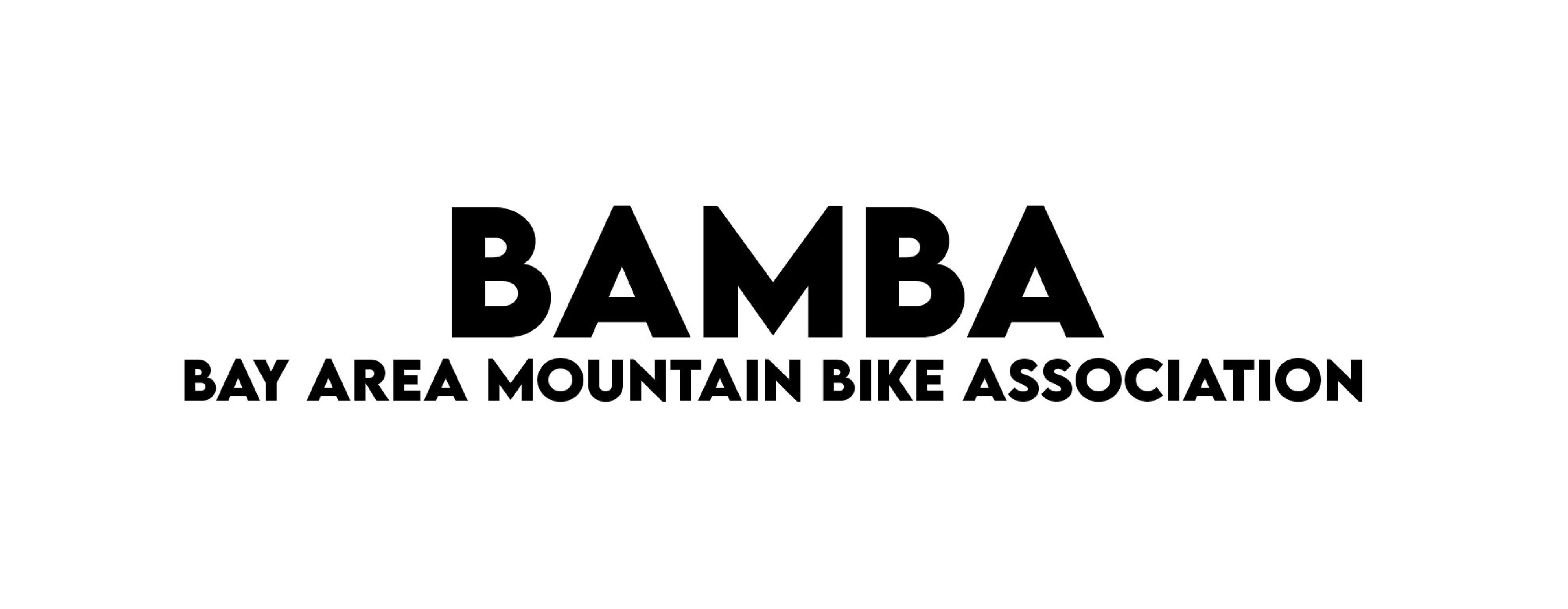
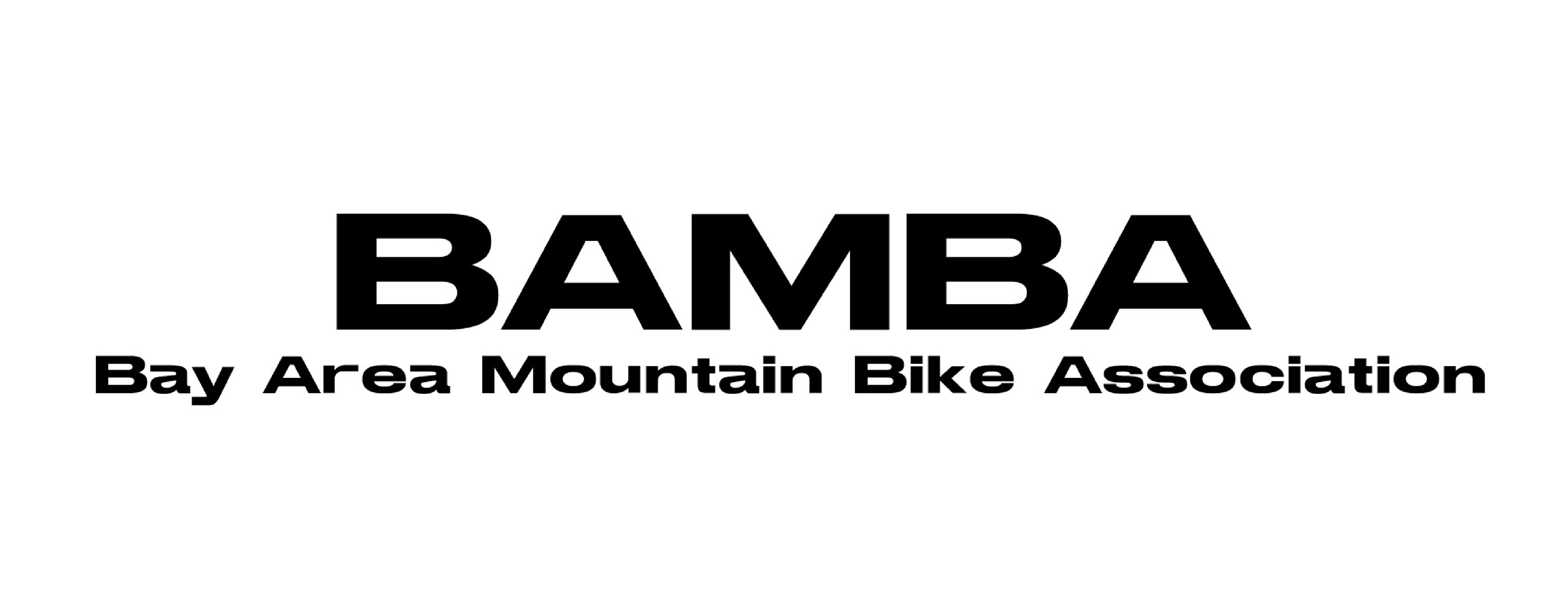
Initial word mark exploration below. We decided on the last font because it felt the most aligned with the brand goals.


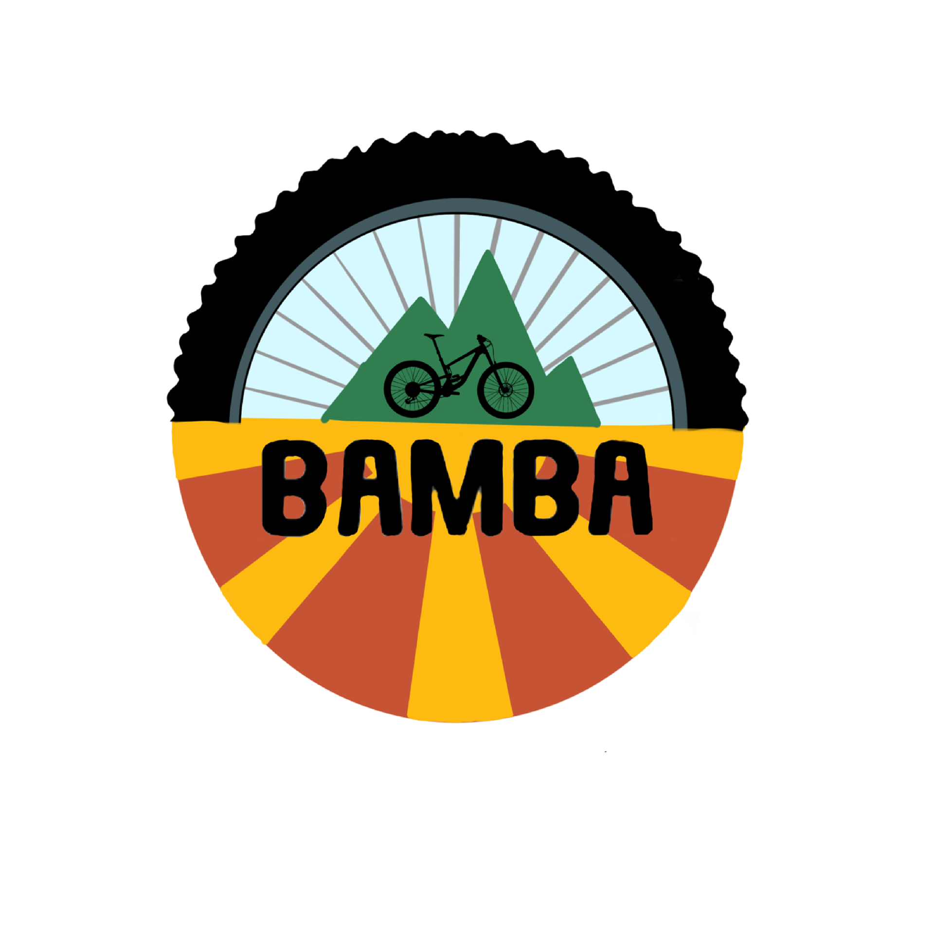
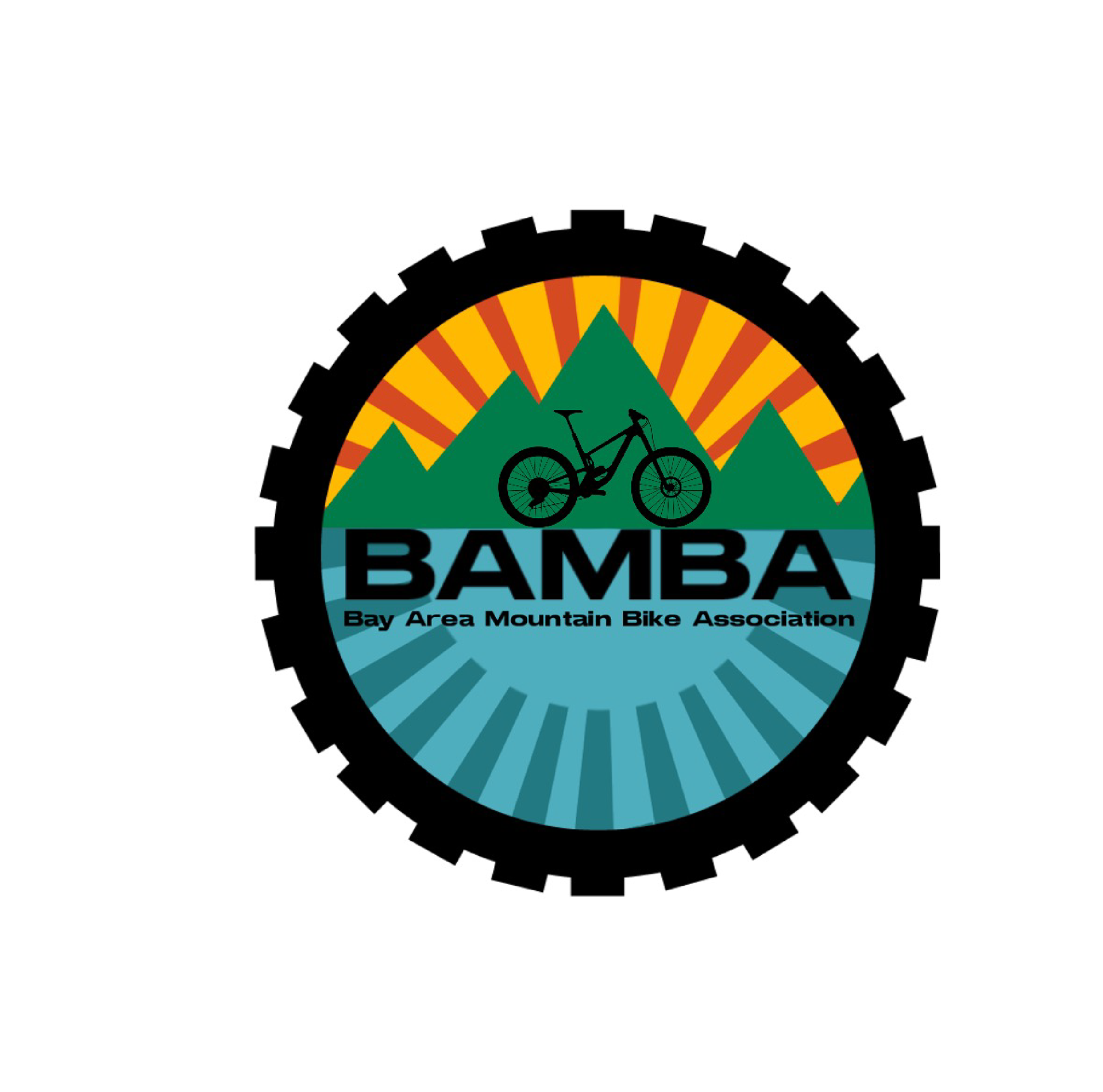
Initial logo design exploration. After deciding on colors, I wanted to find a way to show an outdoorsy bike. I tried to make the tire work, but a simpler design ended up being the way to go.
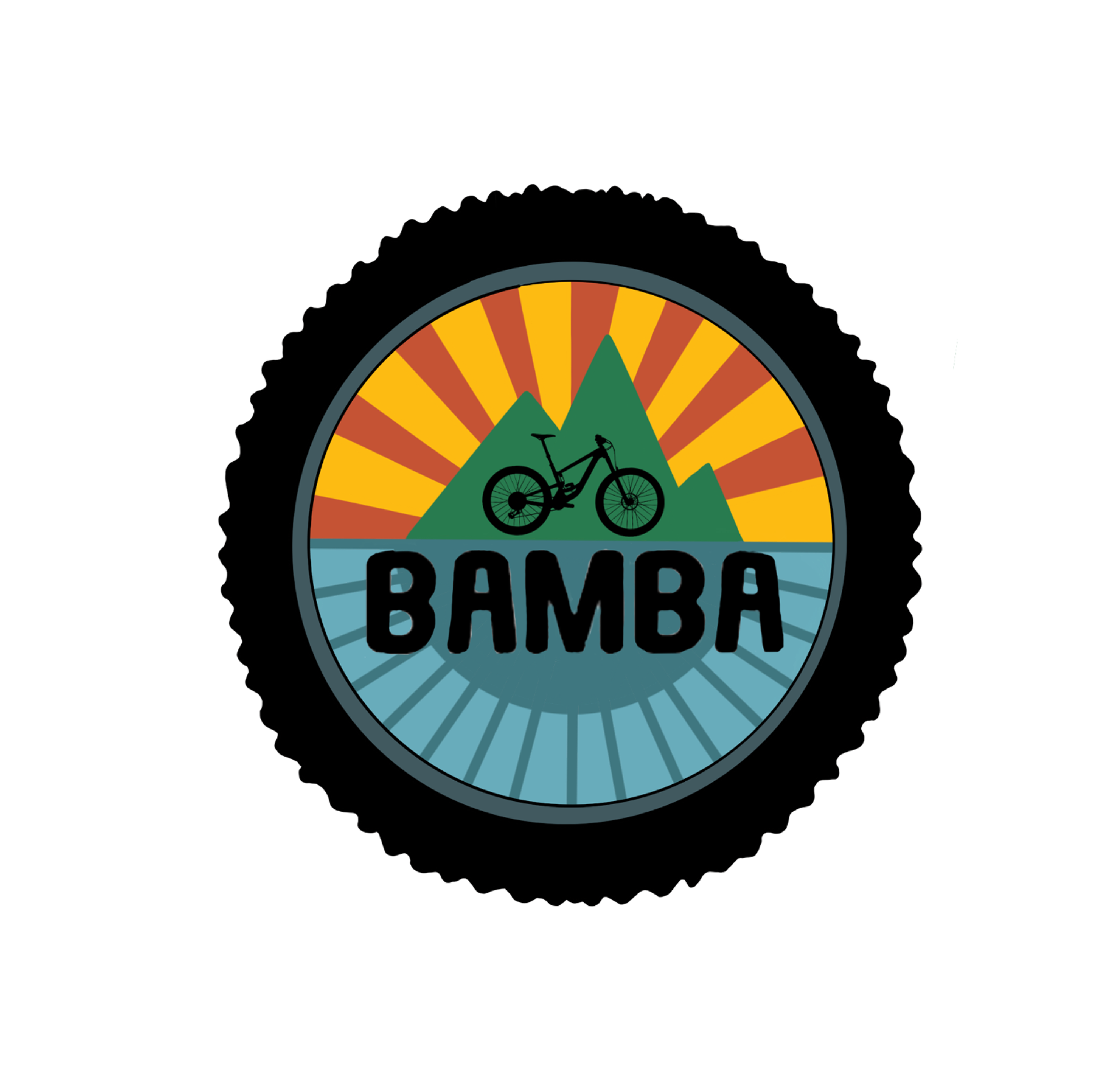
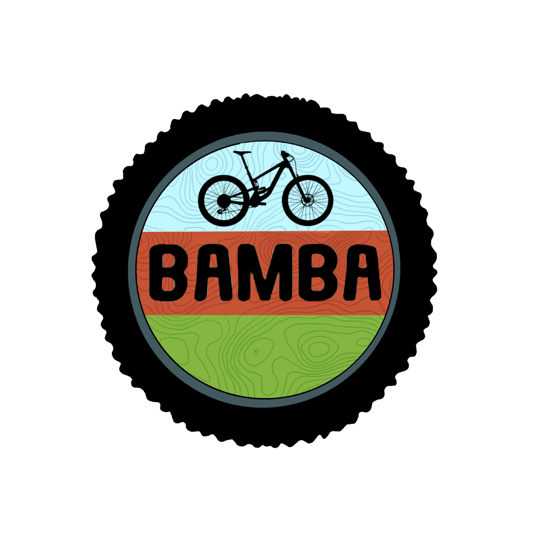


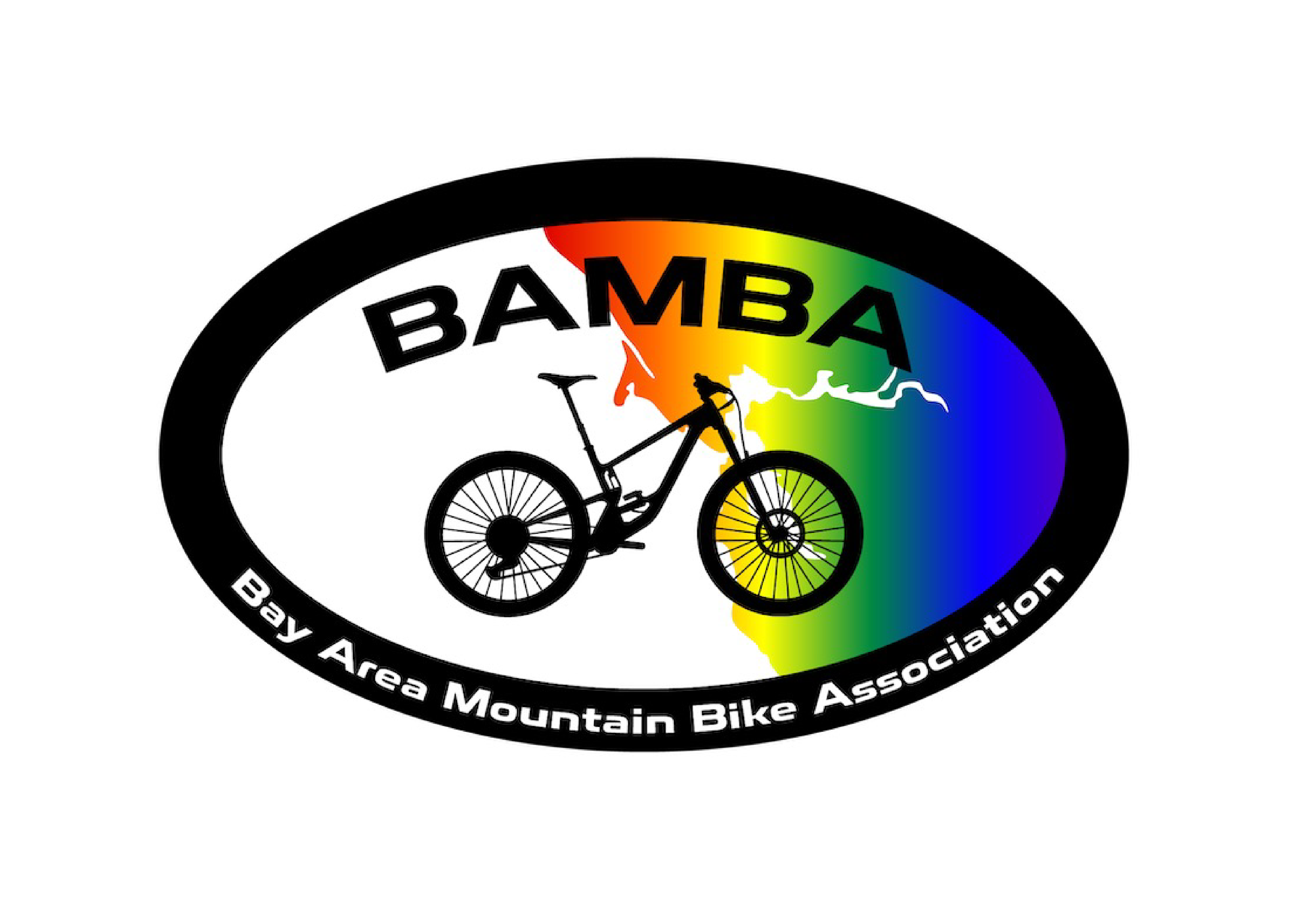
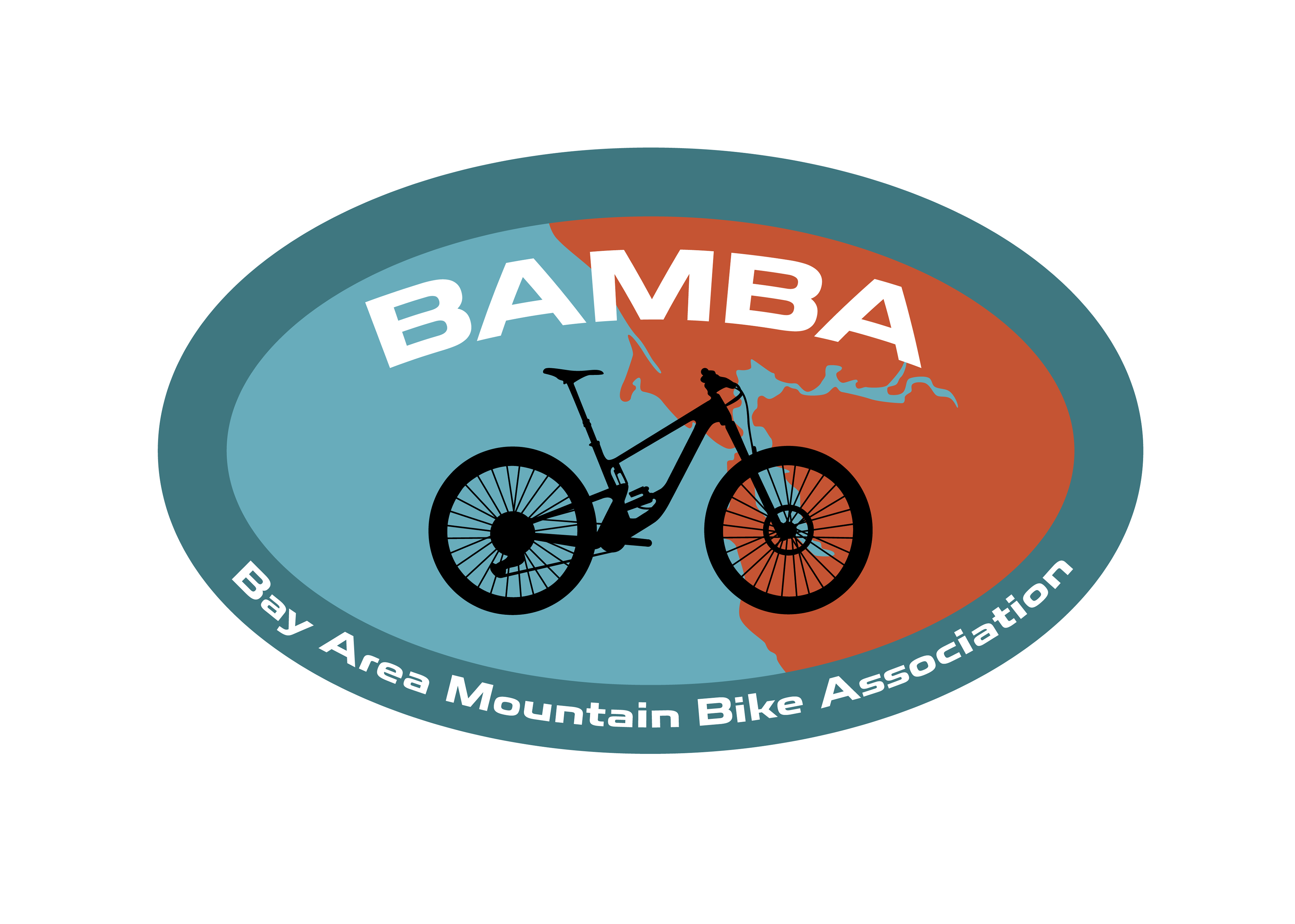
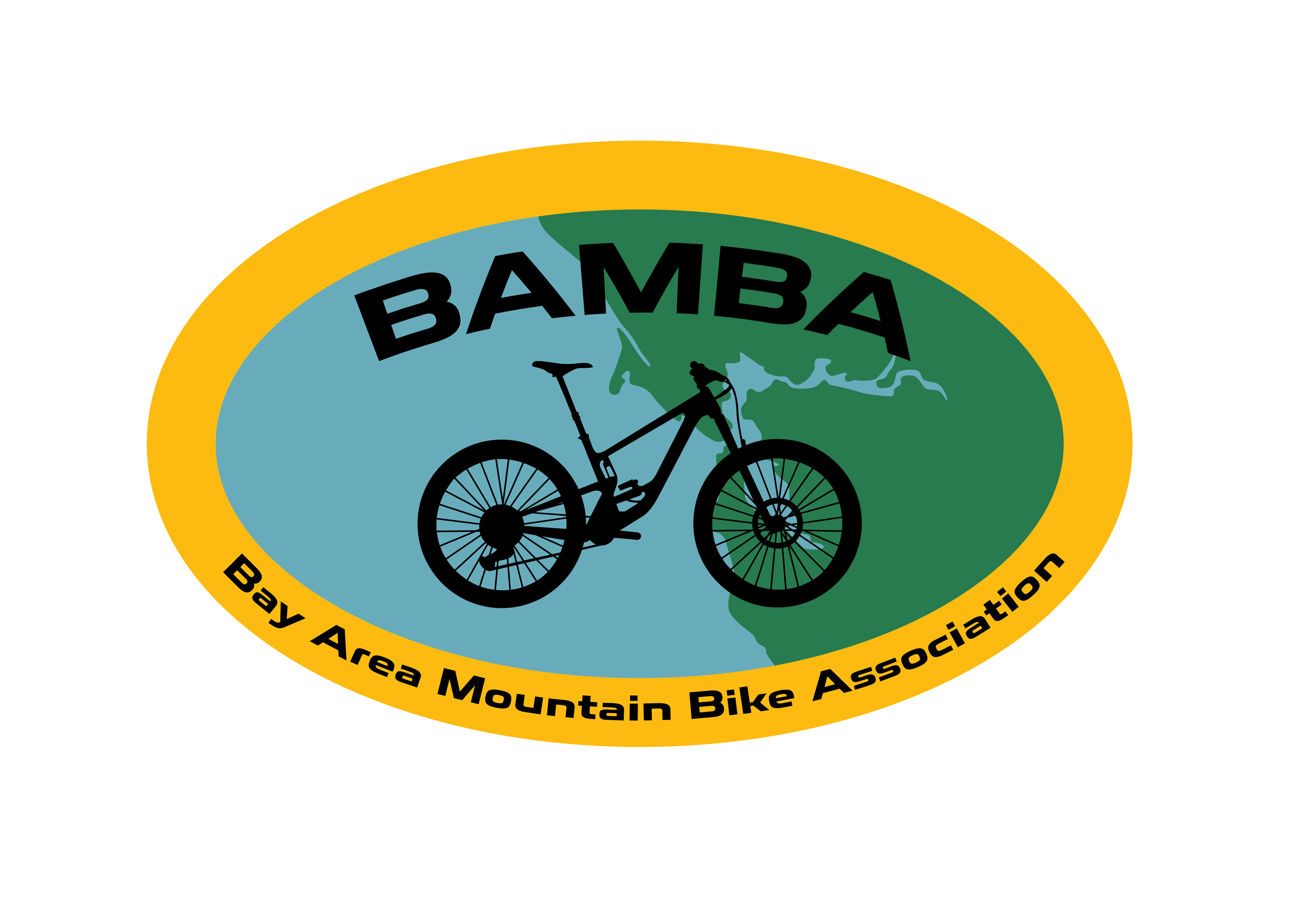
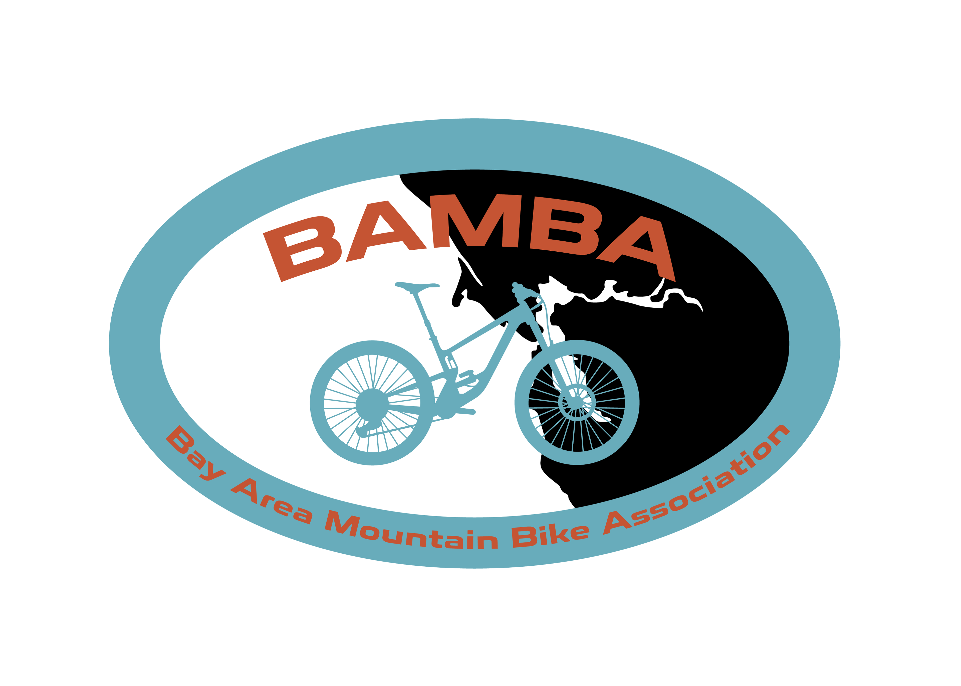
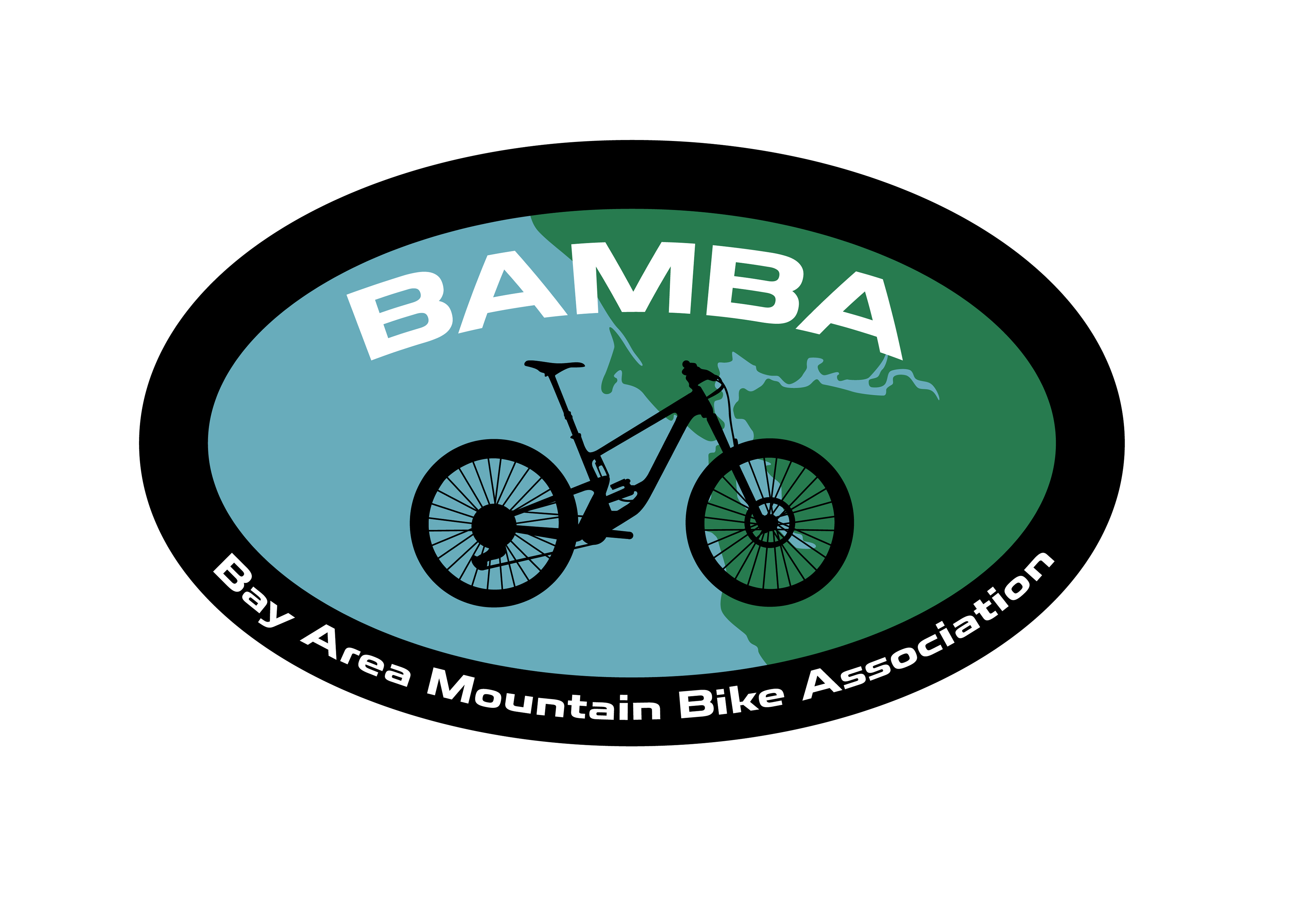
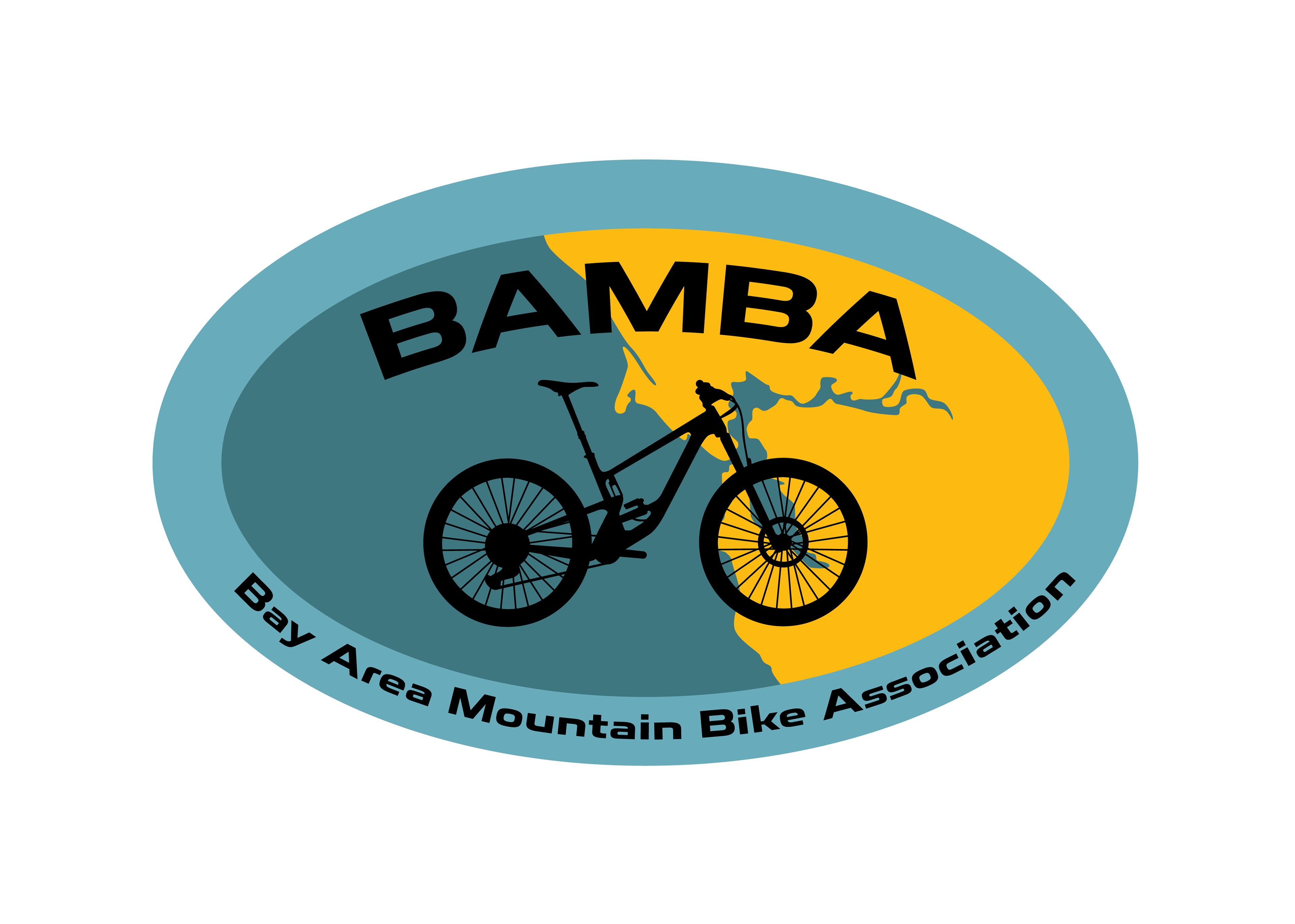
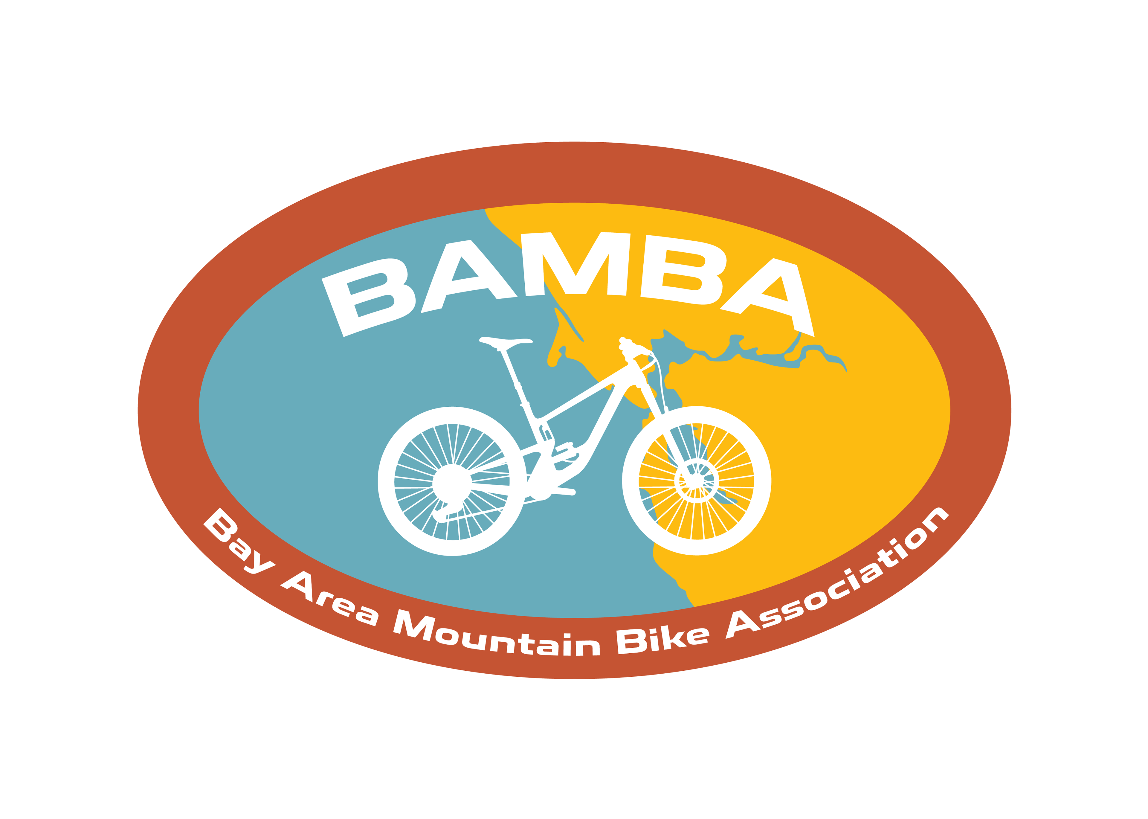
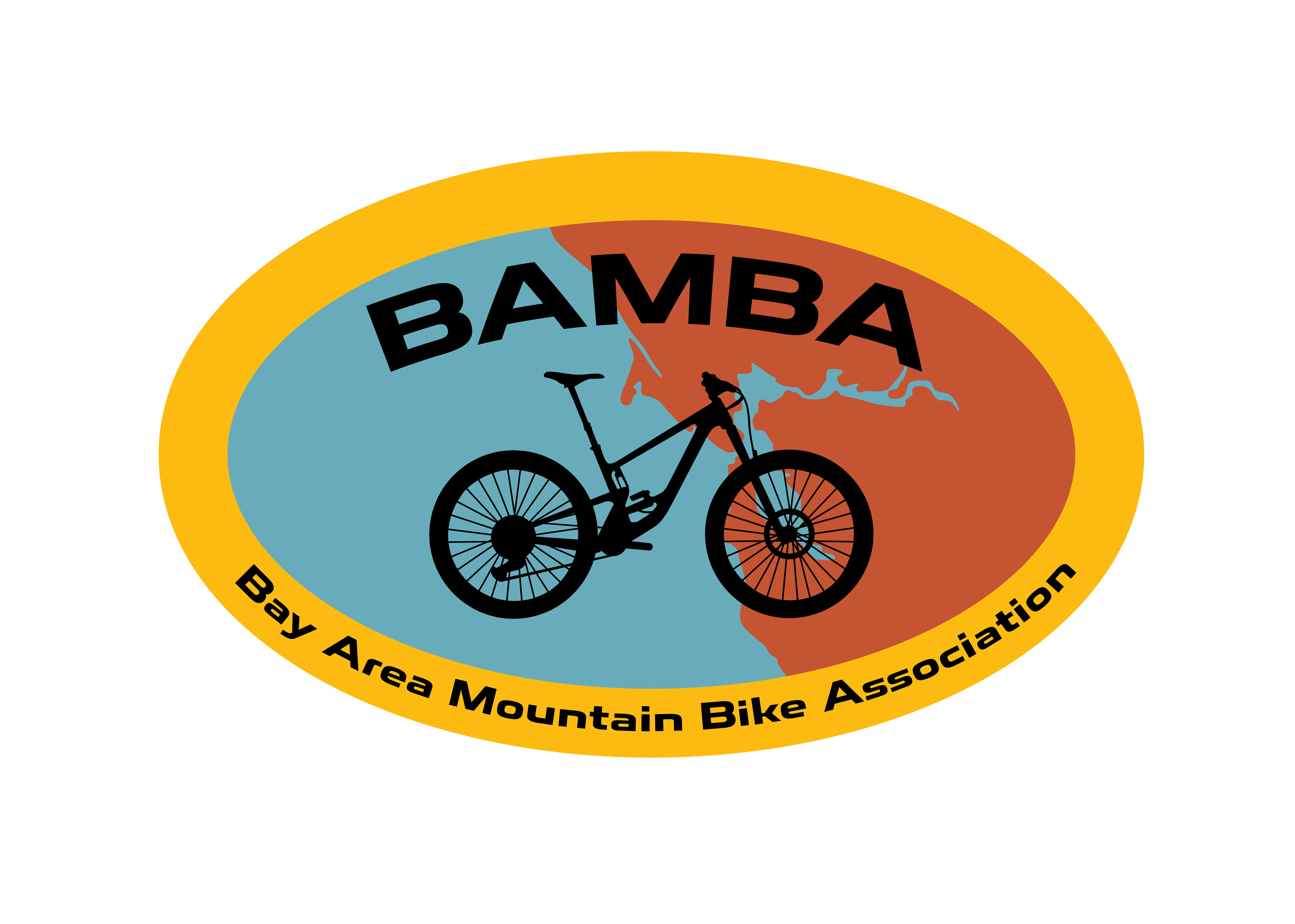
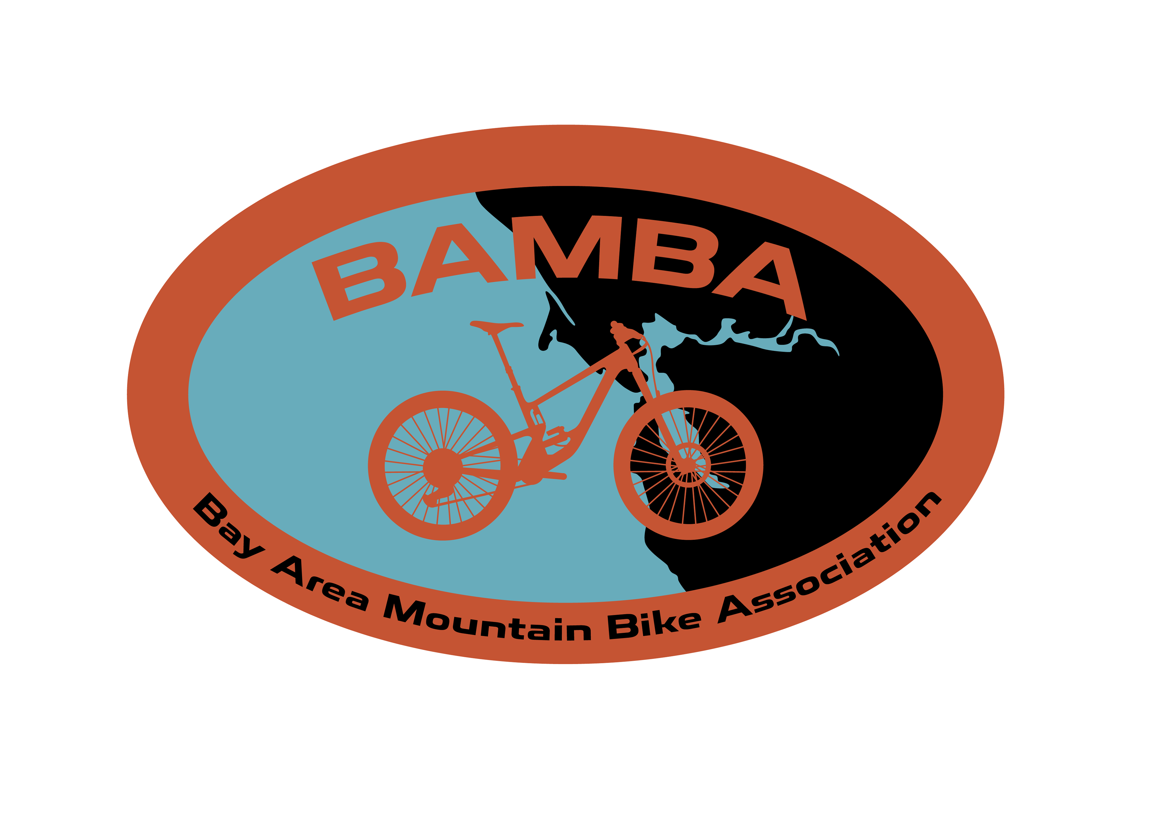
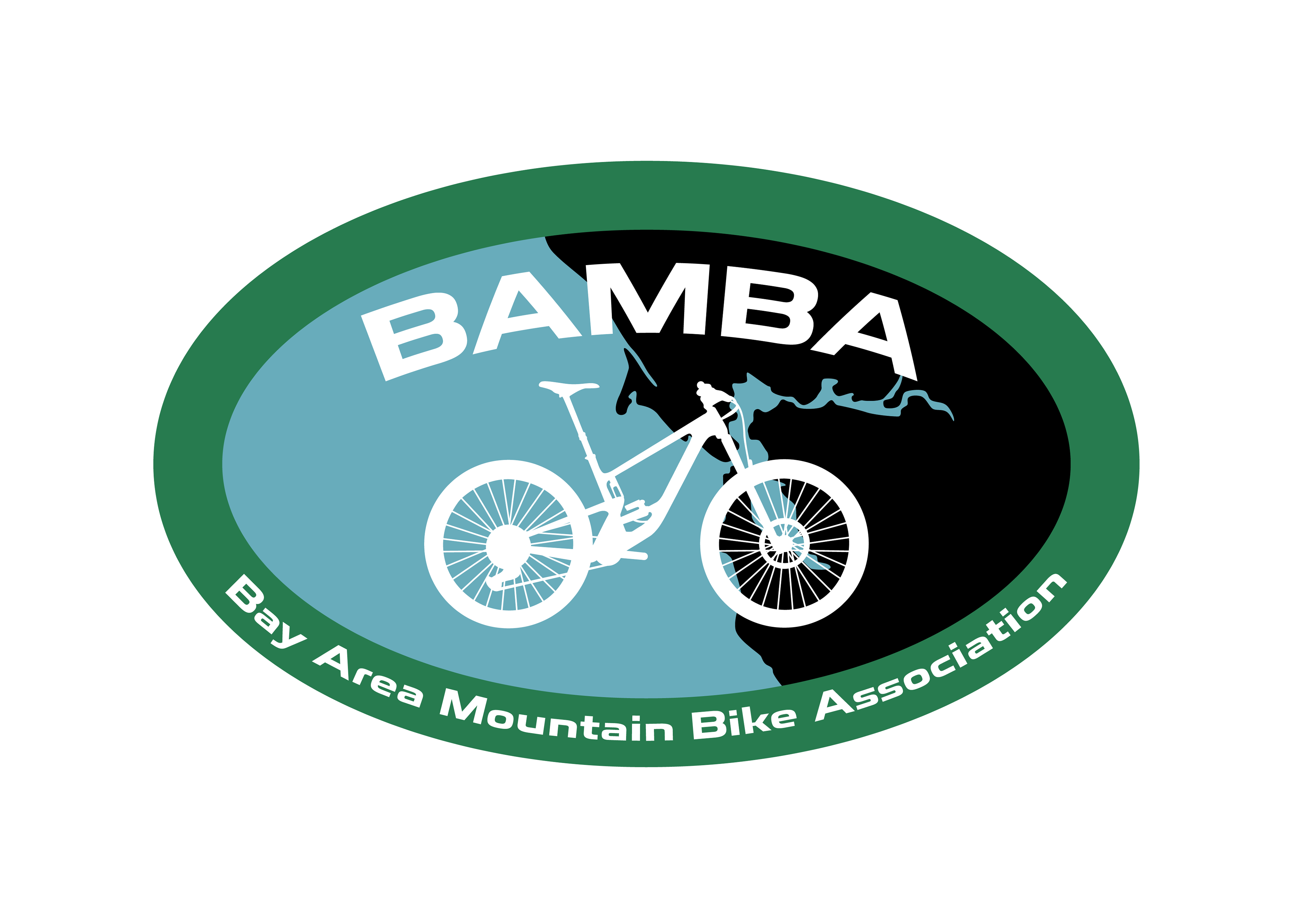
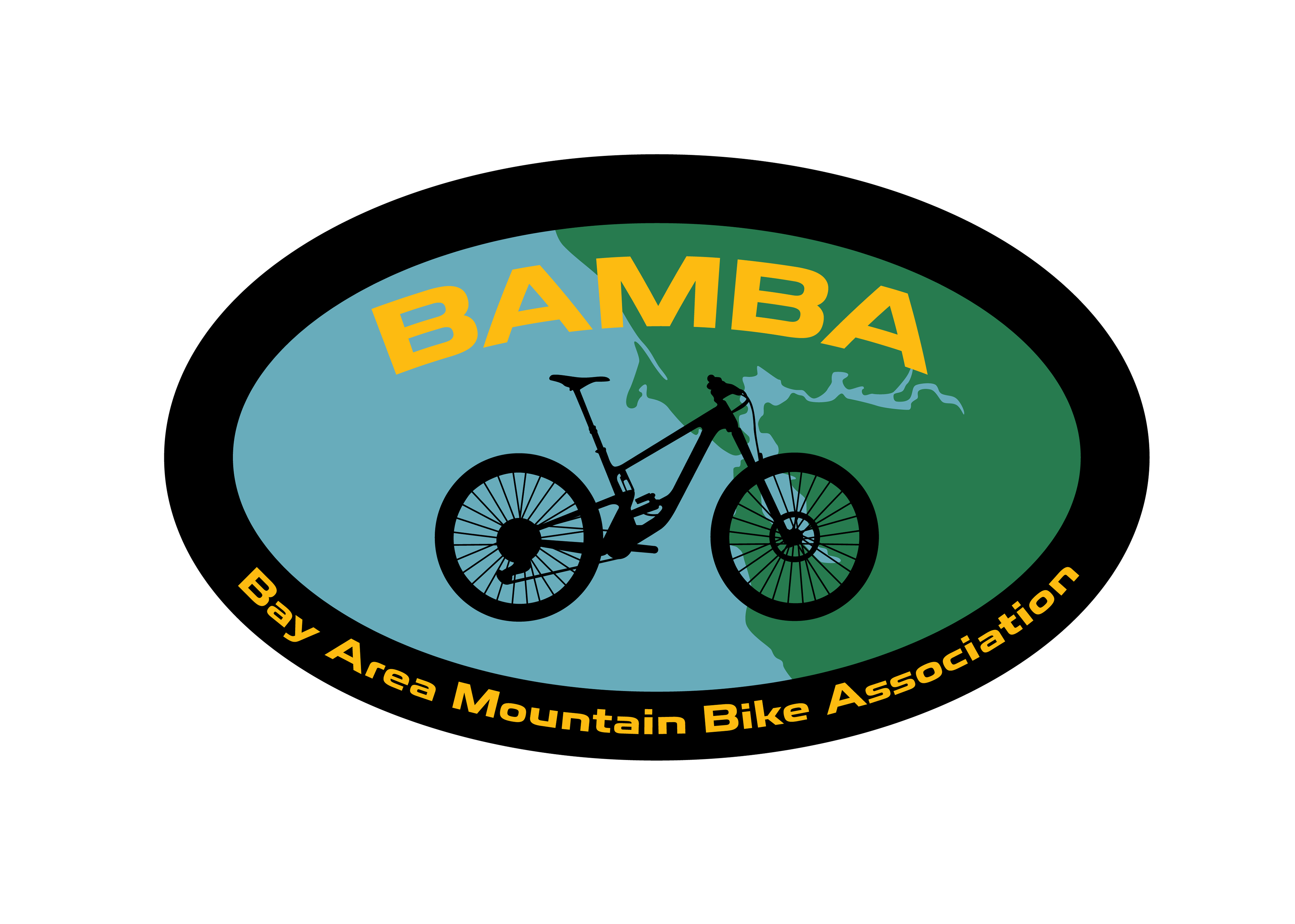
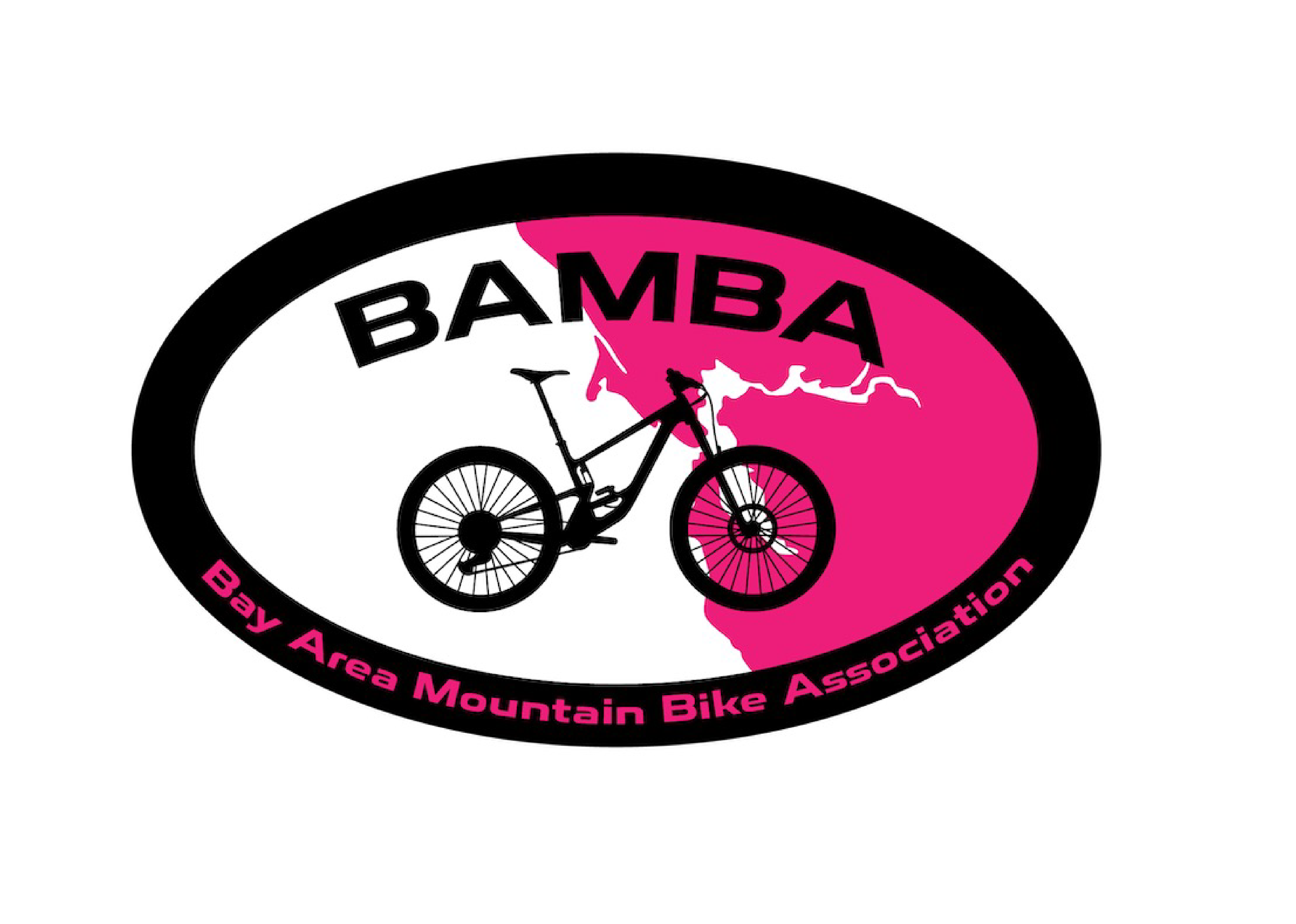
Final logo design iterations below! After multiple circular options, I decided an oval was the way to go. My colleague also wanted to showcase a map of the Bay Area which lead to the background behind the bike. I think this logo is the perfect marriage of rugged/outdoorsy and functional. There are three additional logos at the bottom that do not follow brand colors and were created to celebrate Breast Cancer Awareness and Pride.


Special Breast Cancer Awareness Edition
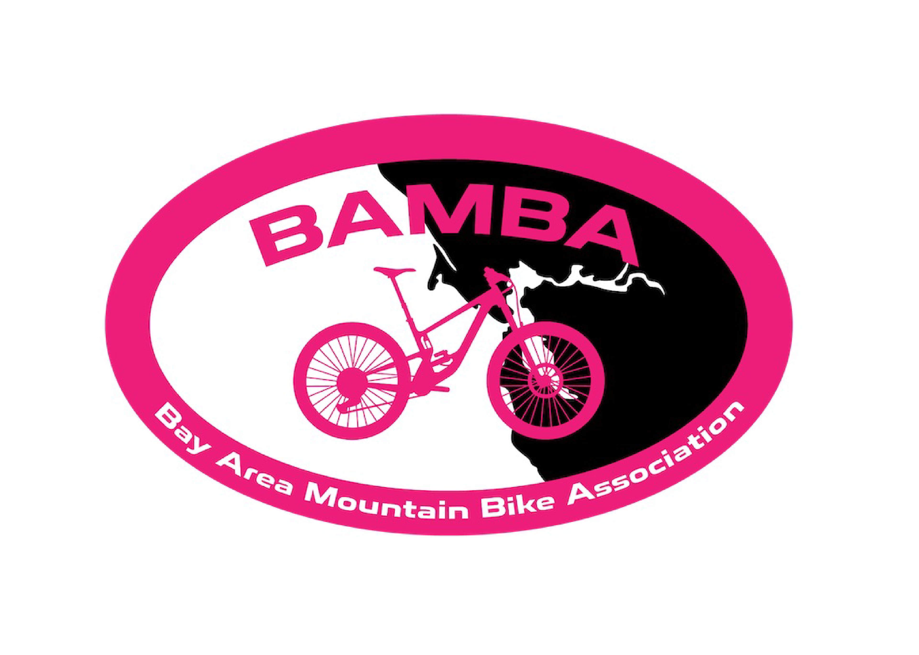
Special Breast Cancer Awareness Edition