Branding of Strobe Boats Alaskan Luxury Boat Tours
I, along with a UX/UI Designer and a Web Developer, took on the task of creating a full brand and site build-out for a new luxury boat tour company based out of Sitka, Alaska. The beginning of this project was pure exploration. The Strobe Team did not have any concepts in mind and encouraged me to draw inspiration from Alaska, nature, and the wildlife it holds, while also balancing out the rustic-ness with a sense of luxury. The Strobe Team is a group of veterans, so incorporating red, white, and blue in some way was a priority.
The three words to describe Concept 1 are: Luxury, “Lodge-y”, and Nostalgic. I utilized the Alaskan Territory quilt block pattern to make the logo. Then I turned it to make it resemble a diamond in certain color ways and make it more dynamic. The colors are cozy and comfortable. Mixing them with a modern font helps this concept stand out amongst the other boat tour brands already in Alaska.
The three words to describe Concept 2 are: Outdoorsy, Fresh, and Clean. This concept is the most whimsical. The font is very modern and lended itself to turning into a word-mark. I manipulated it to resemble a whale tail which makes a fun logo. I also used the whale tail without lettering as a secondary logo and pattern. These colors are bright and lean into the blues and greens of nature.
The three words to describe Concept 3 are: Americana, Nautical, and Classic. The logo for this concept is an abstracted topographic map that also looks like water. This concept is the most tied to America-centric colors which nods to the owners service. I've also used a modern font. The "t" to "r" connection adds some interest and the wave pattern is another use of the lines within the logo.
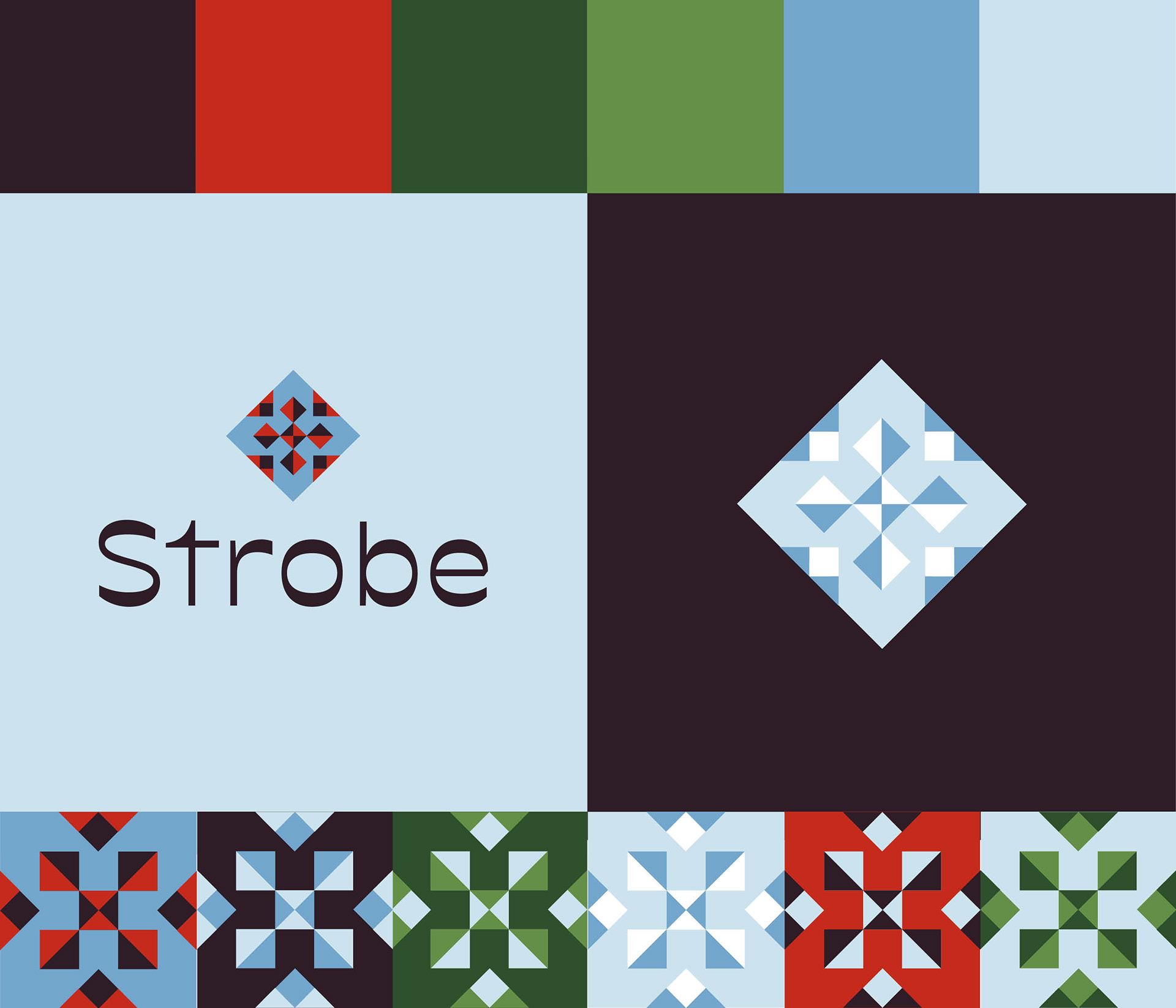
Concept 1

Concept 2
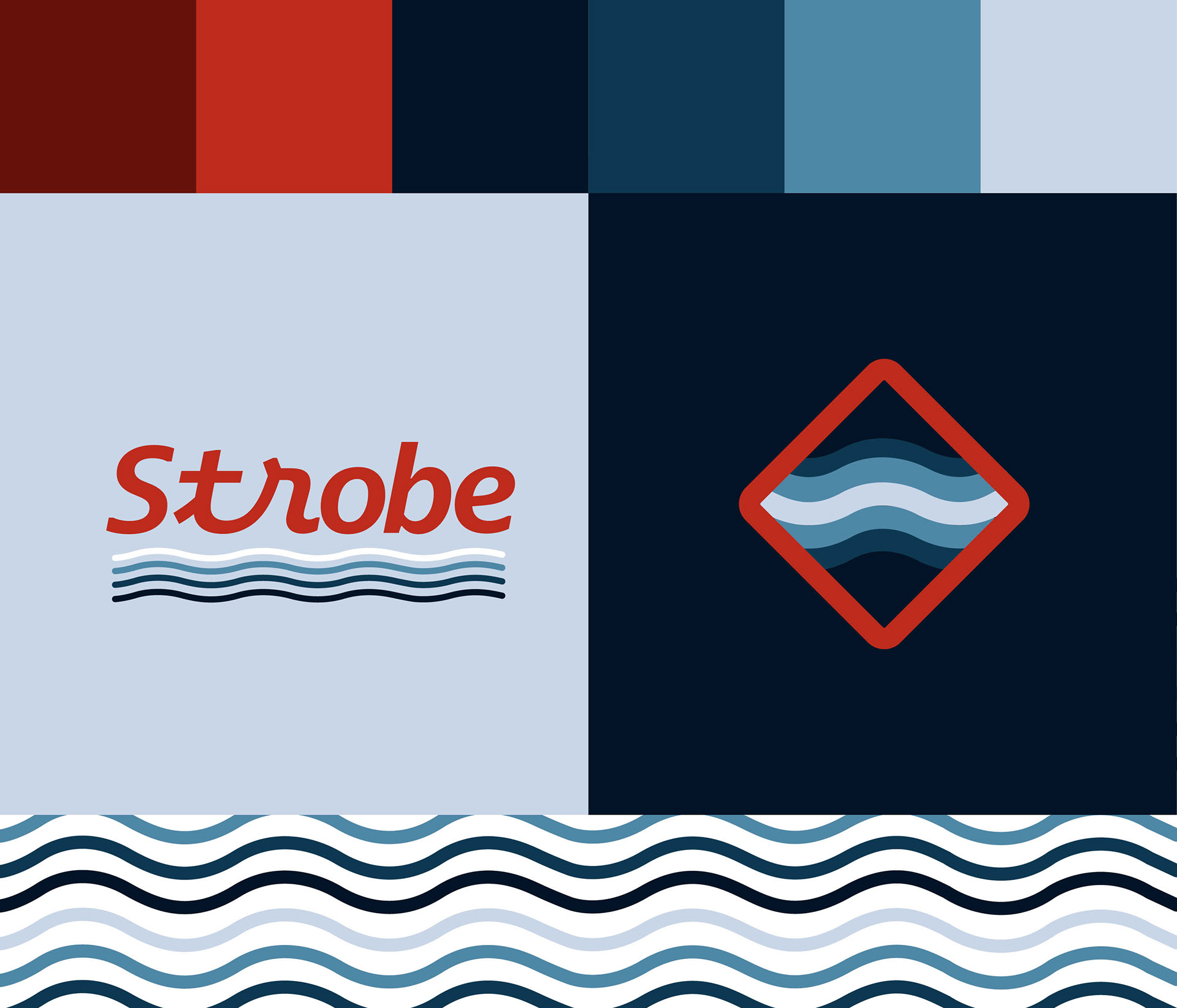
Concept 3
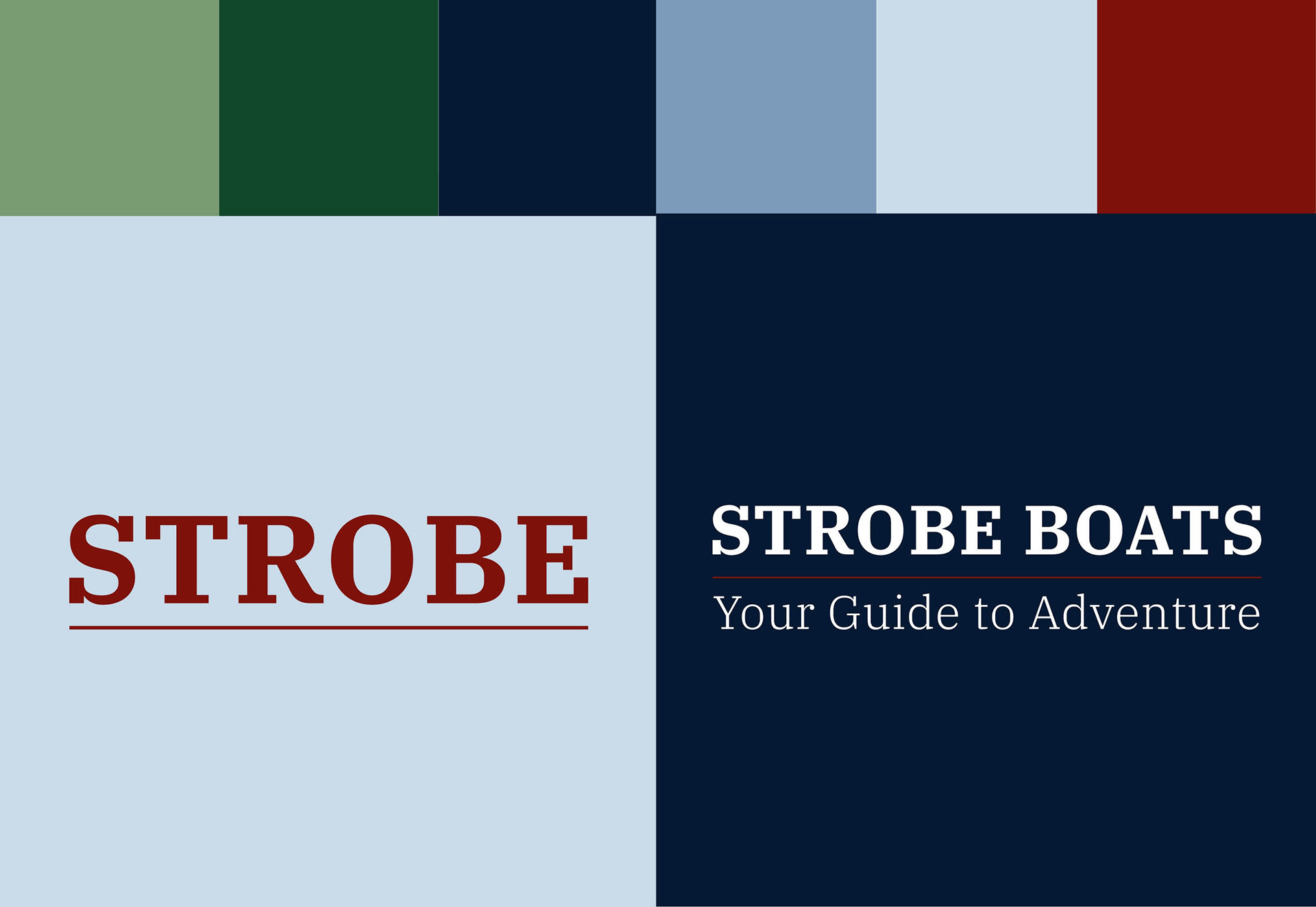
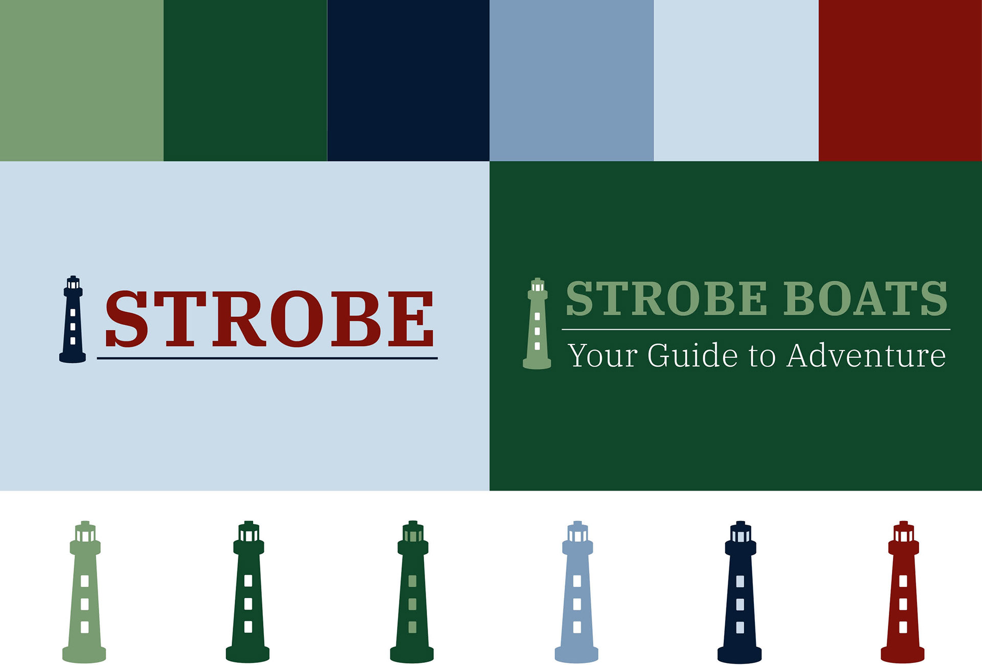
After sharing the initial concepts above, a more traditional approach was decided for the Strobe Team. I created a slightly muted color way inspired by a mix of the three initial concepts. The font is a serif font that has some organic curves in the "S" and the "R". There was also a desire to explore more literal interpretations of "strobe". This lead to Concept 4 which highlights an abstracted lighthouse as a logo.
Upon final review with the Strobe Team, the lighthouse was removed and the words now stand strong on their own! I've included a button to the live site that my team members put a lot of work into as well.
Concept 4